Eventually, that perfect time has come, when individuals and businesses start pondering on new strategies to overcome existing hurdles, make impact, win the game, and stay ahead of the competition. With UX (User Experience) becoming the battleground, it's a must to keep web design and web development going hand in hand.
Why You Need to Read This Blog: Here are Key Signals
- I want to get an impressive and robust website
- I'm not getting engagement on mobile
- I'm not getting the targeted audience
- I'm concerned about the bounce rate
- My website fails to cope with a particular display resolution
- My website has a lower visibility across search engines
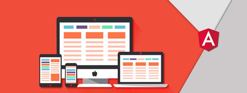
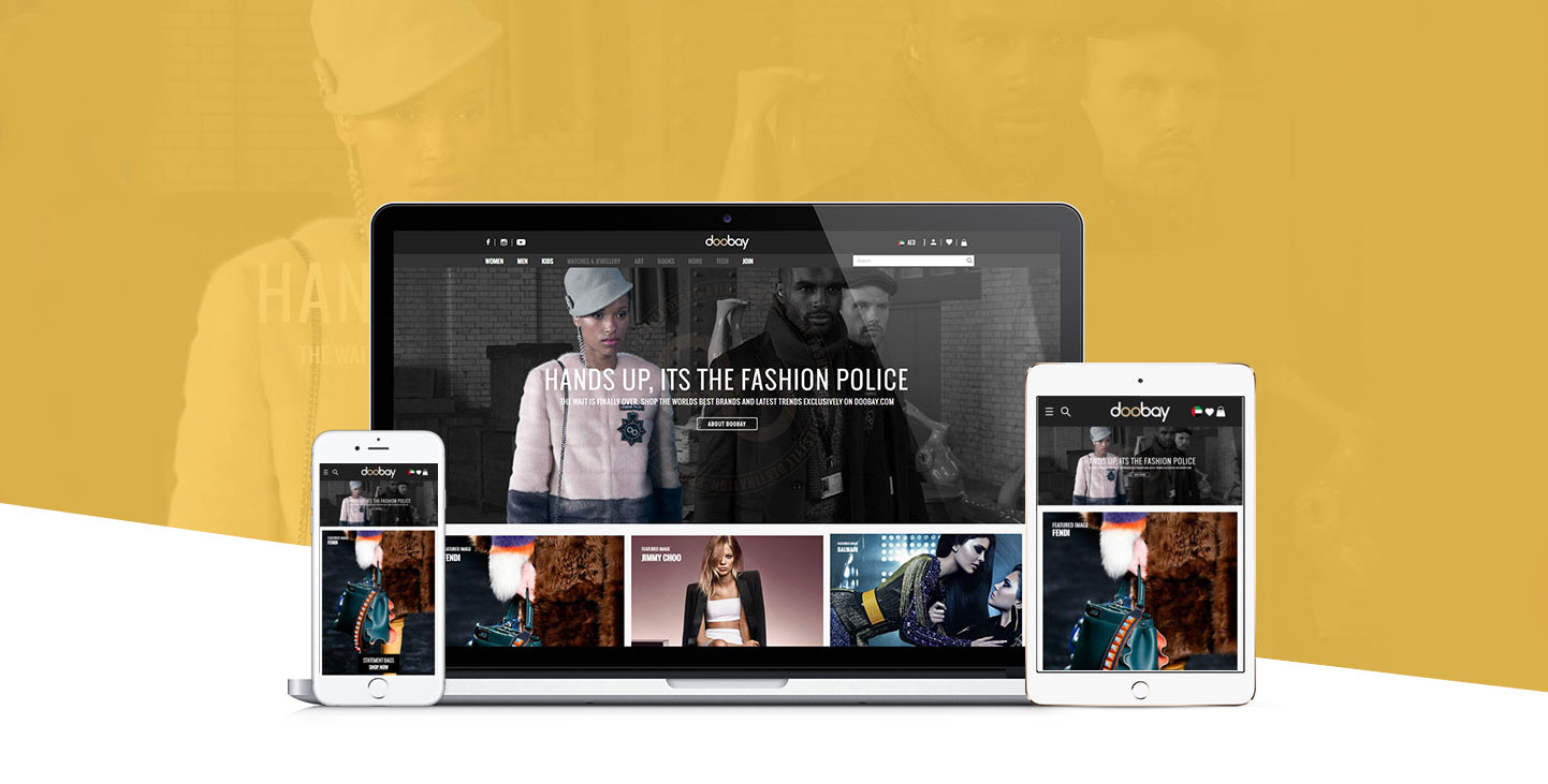
Deliver a Consistent Brand Experience on All Devices
To ace the UX means entertaining the target audiences everywhere, across any device. Expecting web developers to create a masterpiece responsive website with a single desktop-version design can prove wrong. Web developers must be provided with standalone designs for desktop and mobile both. There are web designing tools like Sketch (Mac) and Photoshop (Windows) to make the task easier. However, web designing should be approached with the right template matching the screen size and resolution of the target device.
Pay Attention to User-Flow or Navigation
Step into the shoes of your target audience and make sure that their navigation is easier and without any ambiguity. Let them move backward or forward, upward or downward on your website smoothly, helping them find the right option and information and take the action you want. This is an innate part of User-Experience and must be taken care of across all devices. Hamburger button can also add value to the UX.
Let Device-Orientation Works Correctly
Let users have more control on your website. Aligning your website based on the orientation of the device, you can drive user-engagement and conversion both as users find it comfortable to interact with your business. Device orientation should work on all pages. Hence, the web developer must be in the know of using all forms of device-orientation techniques and tools.
You will like reading this: WordPress Developers Got Reasons to Celebrate
Make Things More Vibrant
Give more flexibility to users to interact with your business. Implement movement or gesture based interfaces, bolder and larger typography and interactive or storytelling visuals including images and videos to communicate your message.
Check Design Attributes in Action
Before getting your website coded, the web design must be validated on a suitable and proven prototyping software such as InVision and Zeplin. Transform the static design into a clickable, interactive prototype, and watch how your website would look, see how the animations and gestures will work and evaluate their impact on your target audience. Designers, developers and other stakeholders can stay apprised of the project's progress and success through a multitude of status update options like on hold, in progress, needs review and approved.