Conversion -- this is the ultimate goal of any customer acquisition endeavor, whether it?s pursued offline or online. In offline mode, there are chances to make a second attempt and correct the mistakes incurred by engaging with the prospects again, whereas, in the online mode, when customers are engaging with your web or app, there is little scope to restore the damage once a customer gets dissatisfied with your engagement platform. Newly acquired app users (from day 1 to day 3 of app installation) are more likely to delete or uninstall an app if the same doesn?t respond well in the first attempt. So this vulnerability has to be reduced.
This guide discusses 25 UX tips aimed at maximizing the conversion rate delivering a superior user experience on Android platform.
Navigation and Exploration
#1. Here is what to keep upfront
- Features addressing the needs of users
- Stuff meant for delighting users
- Call to action
Purpose: Help app users to navigate and explore in your app easily and quickly to find information of their choice.
#2. Organize and label menu categories intuitively
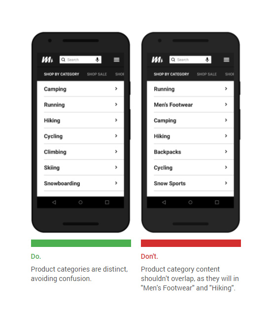
The vocabs used in naming the categories must be concise and commonly used. There should be no ambiguity and overlapping. The Menu should complement well with the search tool. Let users find the information they are looking for effortlessly.
#3. Allow users to "go back" one step easily
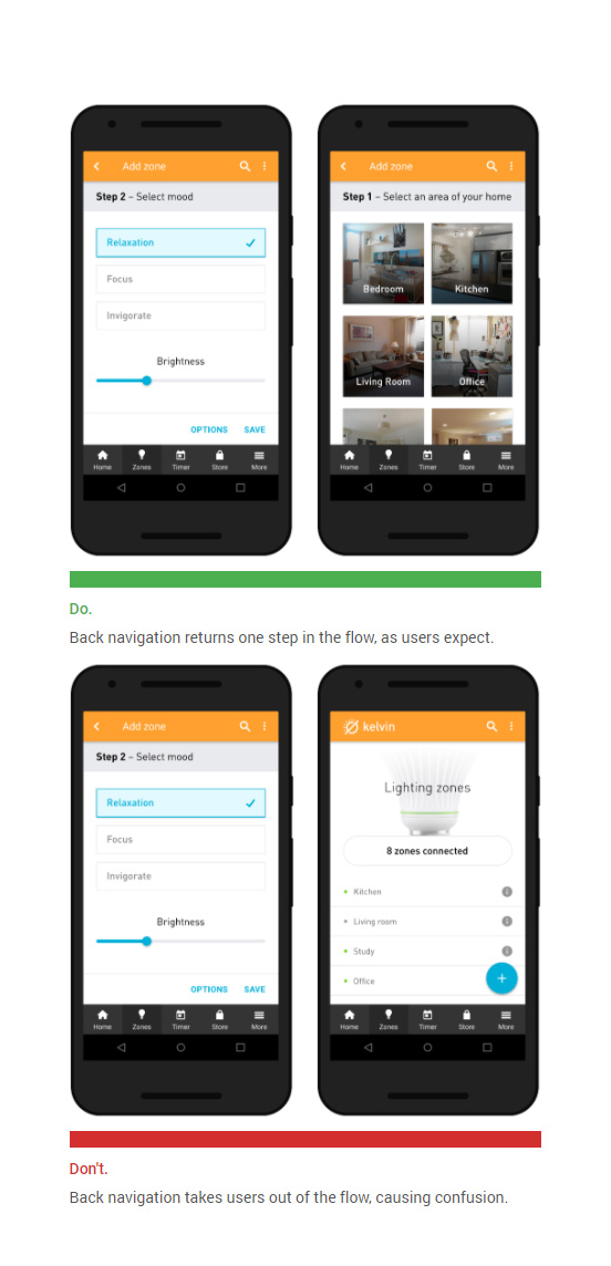
Users do make mistakes and after realization wants to make the correction. So treat users as human when they are with your app. The one step back navigation option helps users to save time as it takes away the hassles of getting started from the home screen.
#4. Make it easy to change location manually
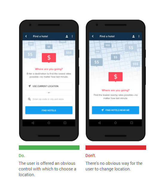
Google Places API is a wonderful technology that auto-detects location information of the users and accordingly suggest them of stores available in their close proximity. However, at times, users are interested in locating a store as per their convenience -- might be a place that falls on the way to their office, near the office, or any other locations. So let your Android app allow users to change the location manually and find the desired information.
You Might Love Reading: App Design Secrets Followed by the Android App Development Company
#5. Create frictionless transitions between mobile apps and the mobile web.
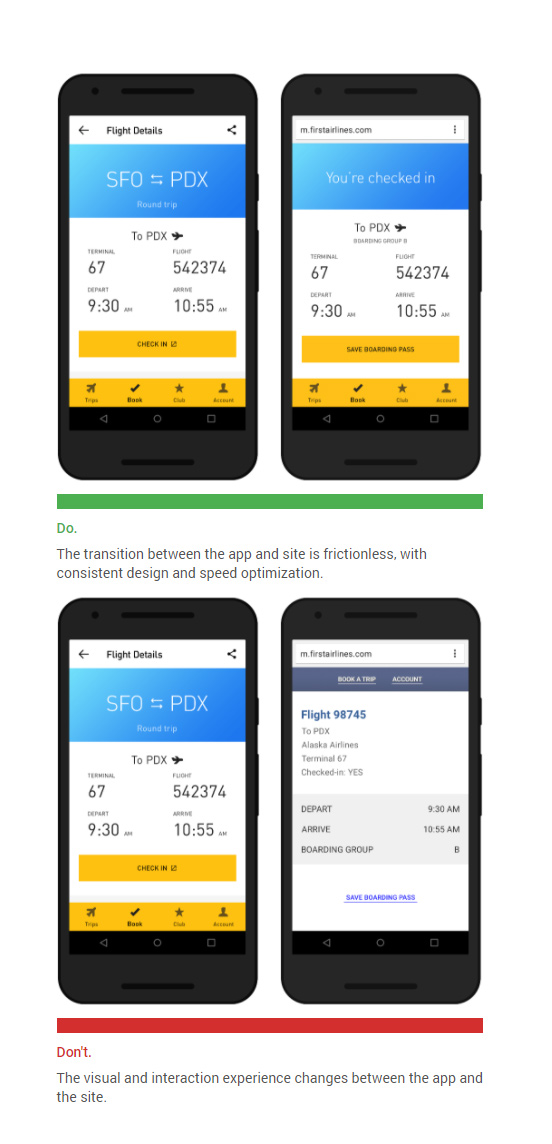
Make transition between native and web content frictionless and faster-leveraging Chrome Custom Tabs. This will help the audience to feel at home while switching between the two versions, thereby, resulting in a better connectivity with the target audience.
In-App Search
#6. Display the search field prominently
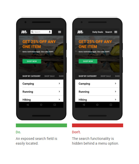
Provide a user-friendly and powerful search weapon to users. Keep it easily accessible via the home screen. Android developers assigned with the task need to leverage the Material Design elements as listed below.
- The material theme
- Widgets for cards and lists
- Custom shadows and view clipping
- Vector drawables
- Custom animations
- Widgets for navigation drawers and other components
Search is a key element to driving user engagement by allowing users to find the relevant information they need.
You Might Find This Interesting: Shopping Cart Abandonment Factors Puzzling the Best Android App Development Companies
#7. Use effective search indexing
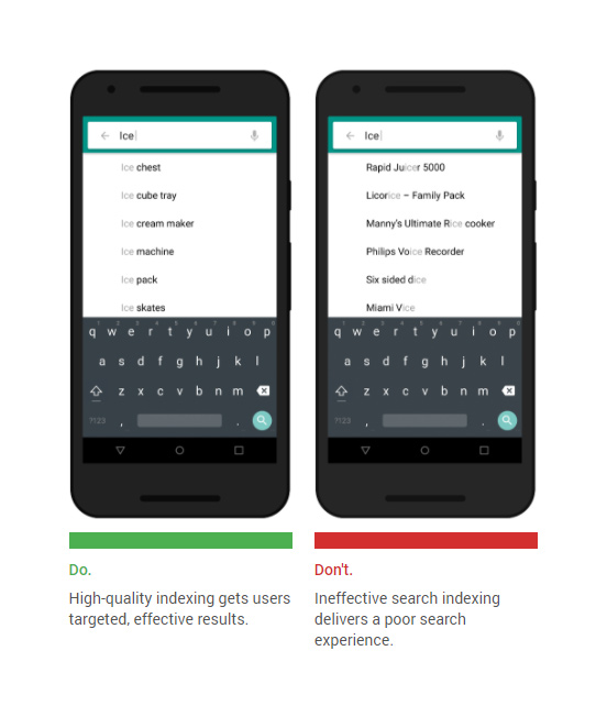
Sharpen the edge of your search weapon by ingraining it with functions like spelling auto-corrections, recognition of root words, predictive text, and suggestions. This will ease the typing challenges on a small screen like mobile and let users get relevant information in a quick and easy manner.
#8. Add a filter equipped with relevant sort options
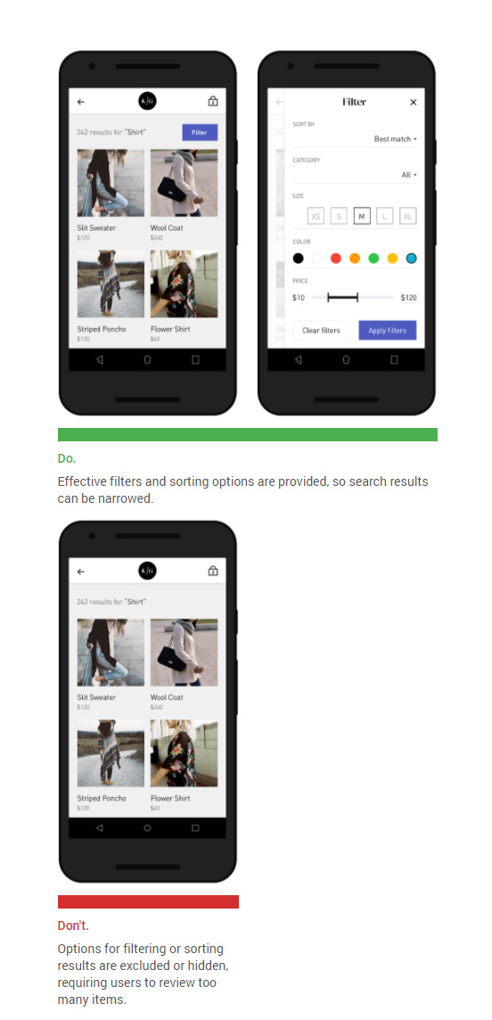
Don?t let users get puzzled with irrelevant information. Help them narrow down and organize their results. Enabling them to find what they need in a quick and easy manner, you earn their favors in terms of engagement, conversion, and ratings. Overall it helps you monetize your technology investment and grow your business.
#9. Make search and payment history available
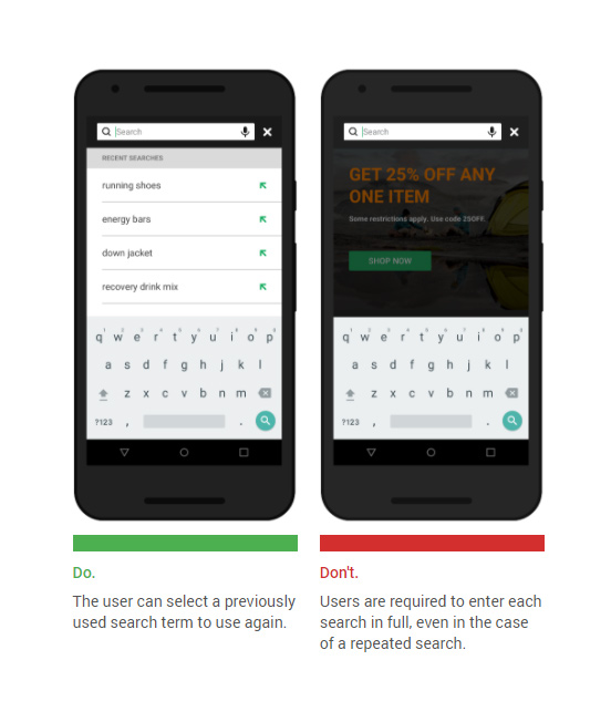
The whole purpose of a user coming to your app is that s/he intends to save time and effort. So allow her or him to start from the place where s/he left last time. Let them see information or items they searched for along with the purchase history if any. This will help them conclude the current purchase in a quick and easy manner.
You Might Love Reading: Top 5 Tips to Beat the Android Mobile Commerce Blues
#10. Allow user reviews to be sorted and filtered
![Allow user reviews to be sorted and filtered [Click and drag to move] ?](/sites/default/files/inline-images/top7_0.jpg)
Reviews play a key role in the purchase decision-making. Allow users to filter and sort reviews based on relevancy and freshness. Try to keep verified reviews as authentic statements are highly appreciated by buyers.
#11. Enable comparison shopping features
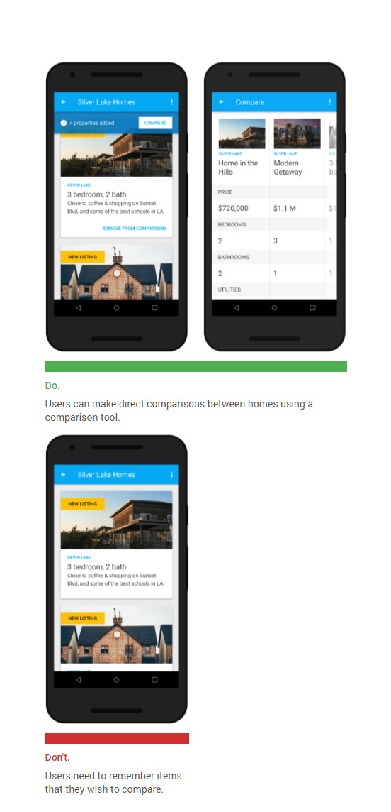
Shoppers love to see alternatives so make sure they are able to compare products in the same category within the company, and beyond that if you have the confidence. A user-friendly comparison feature makes it easier for a shopper to take the call and drives the conversion.
Get deeper into the human psychology with this blog titled ?Learning Curve for an Android Application Development Company?. Learn what users hate and love about an app.
Payment Options
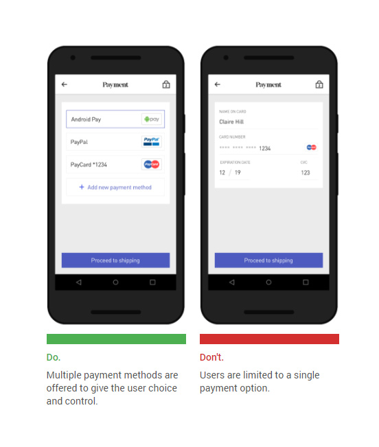
#12. Provide multiple payment options
Give flexible payment options, reduce the checkout hassles and elevate the security level, if you really care about the convenience and privacy of the users. And doing so you are likely to end up with the jaw-dropping conversion.
#13. Make it easy to edit and add payment methods
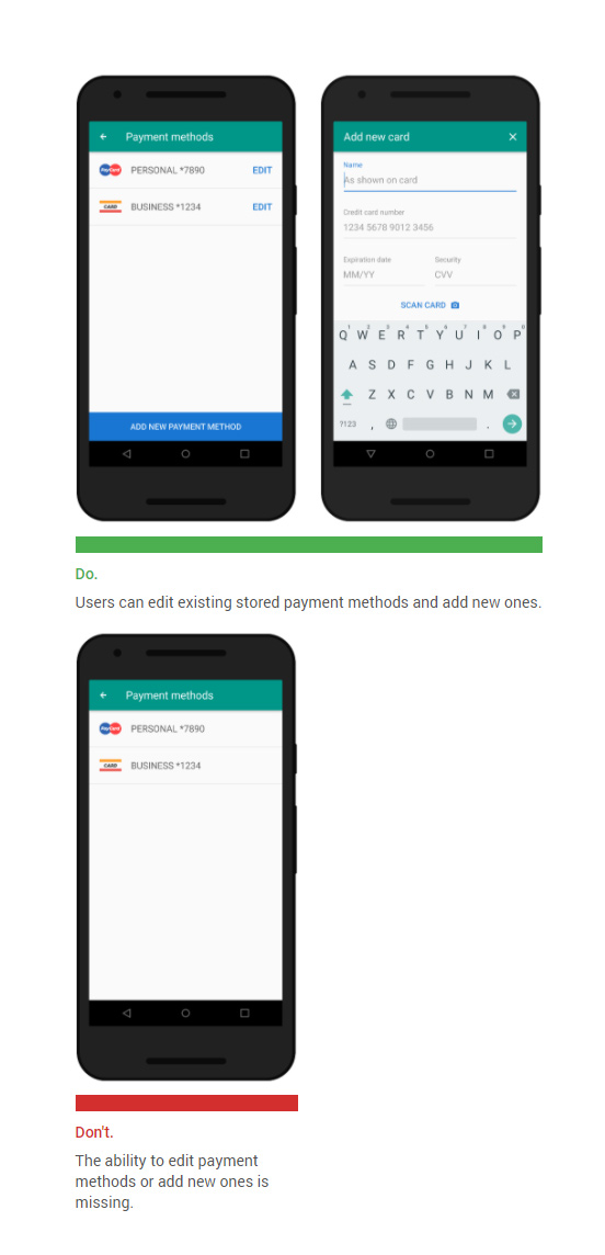
To err is human and to forgive is divine. So you have to play the latter?s role and make sure that your app users are able to edit payment details as and when required. Also, allow users to add multiple card details and toggle between them. Provisioning the flexibility you up the ante of conversion and ROI.
Registration
#14. Ask users to register but not without reasons and let them understand the benefits of it
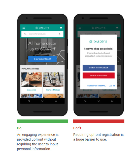
Don?t expect users to submit their personal information to you without reasons. They won?t and they are right. Compulsion will only lead to app abandonment. Till the time you don?t disclose why you need them to register with your app and what benefits the registration brings in, you are likely to court app abandonment. So minimize the rejection.
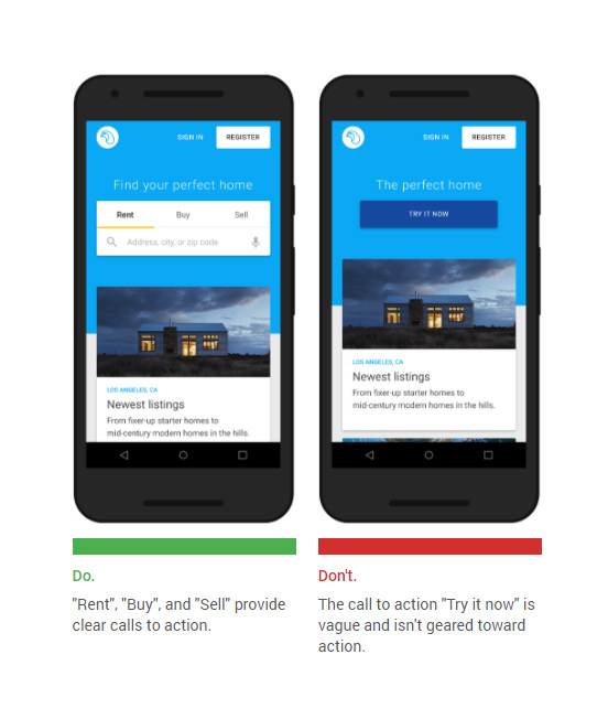
#15. Differentiate "sign in" from "sign up"
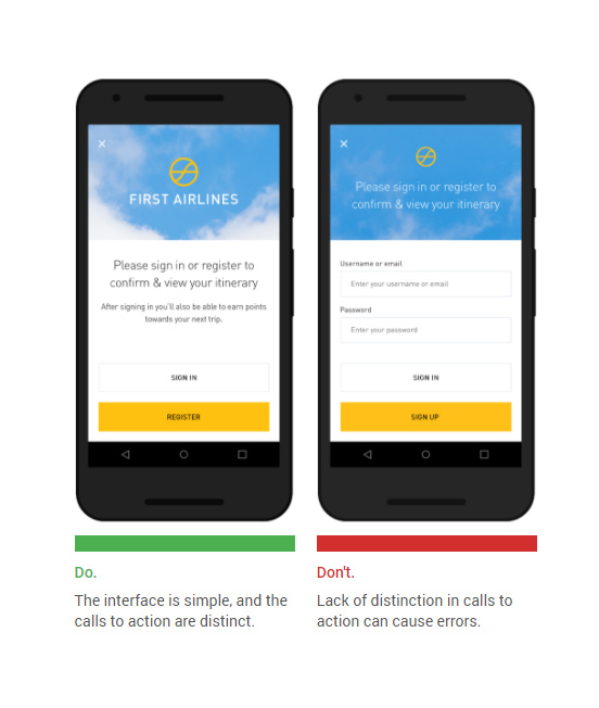
Let users don?t get confused between the duo, thereby killing their time doing the meaningless task. Similar attention is required at every aspect of the app. The Clear distinction makes the app texts more legible and drives conversion. Also, explain to the users the purpose or benefit of signup.
#16. Make password authentication a frictionless experience
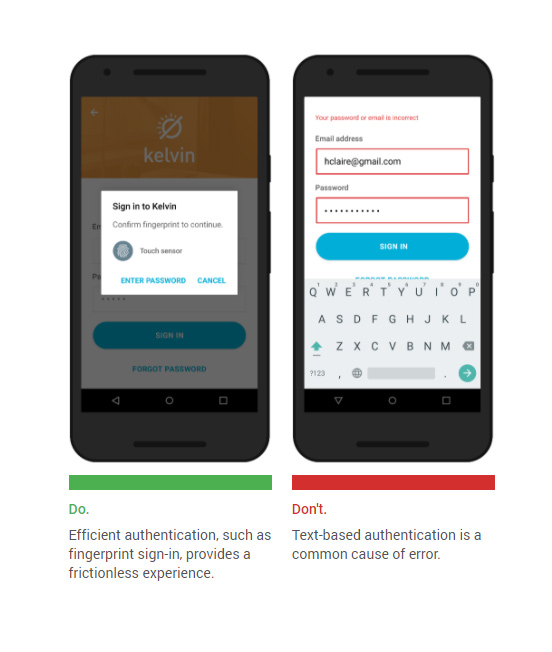
Providing authentication-based access is important in the app but it shouldn?t be made at the cost of user experience. Leverage the various Google Identify platforms including Sign-in for Android, Smart Lock, and sign-in hints. However, don?t mandate multiple authentication methods as that?s time-consuming and irritating.
Forms and Data Entry
#17. Build user-friendly forms
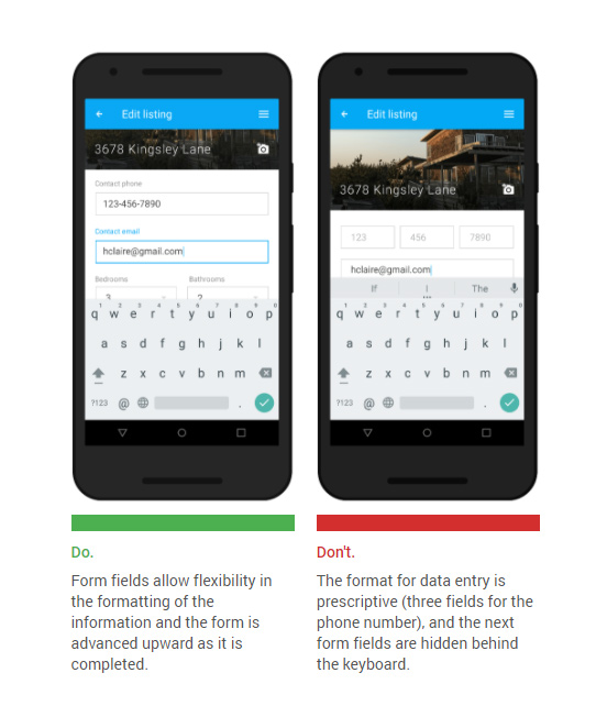
Filling a form is a trying and boring experience. So can you dare to get rid of it? Obviously, not. It?s a serious means of getting leads and achieving conversion. So make the optimum use of the Material Design elements to create a device- and user-friendly form. Compatibility of the form with the device screen and the input tools is a must. However, make sure that form fields not getting obstructed or overlapped by the input elements. Also, make the form fields scroll up while users enter their information.
#18. Communicate form errors immediately
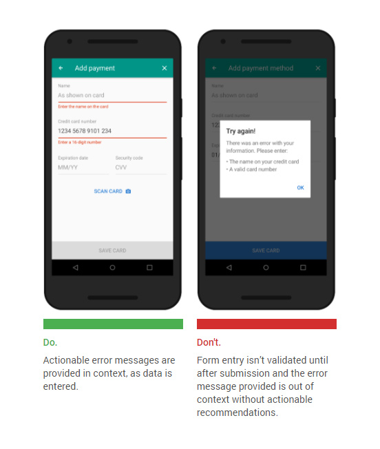
People make mistakes and users are no different. However, your role as an app owner or Android developer should be to let them see the right way. Let users spot the mistake, make corrections to it and successfully fixed the problem. Apply a validation method connected with the user?s phone number or registered email ID.
#19. Match the keyboard with the required inputs
Let users find the right keyboard to make an input. For instance, if they need to enter the credit card, DOB or password, etc. make the numeric keyboard pop-up automatically. Likewise, for entering alphabets, the app must come up with a relevant keyboard. This will save time for the app users.
#20. Provide helpful information in context informs
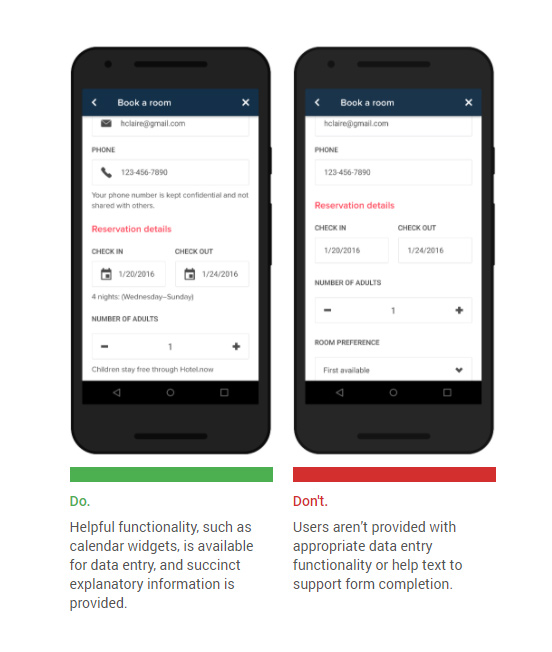
Want your users to skip your form, just to figure out date and day or know what to enter? Obviously, this will only deteriorate the conversion prospects. Think to incorporate calendar and contextual information wherever required in the form. Let users fill it without taking help of other apps or persons. For instance, when you need to enter date details, the integrated calendar widget will make the user fill the field instantly without cross-verifying the info with the calendar app available on his or her device.
Usability and Comprehension
#21. Speak the users? language
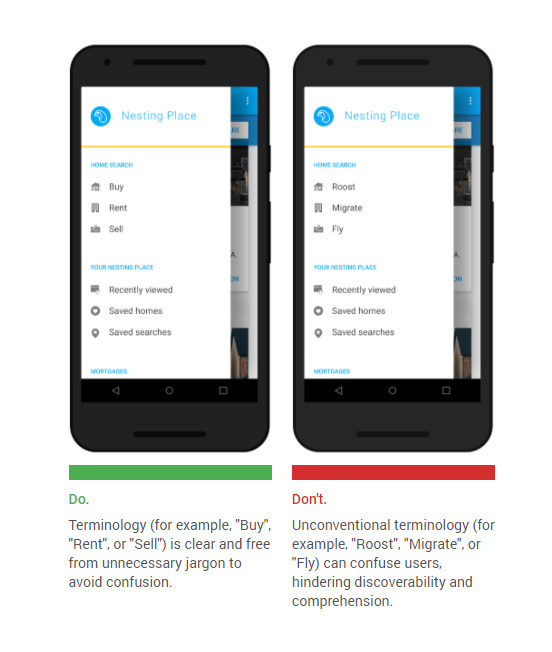
Jargons are spoken and understood within a limited circle. So avoid using them as doing so limits the reach of the app deteriorating the user experience. Use simple terminologies. This is what Material Design guidelines also suggest. The idea is not to confuse users but to establish a better connectivity with them to drive conversion.
#22. Use right text labels and icon keys to clarify visual information
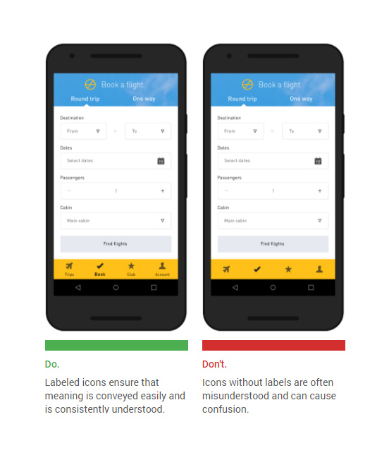
Using the right icons and labels (if required descriptions) helps users to better engage with the app to get the intended jobs done. By merely looking at the icons and labels users can know as what the field is about. This will drive user engagement and boost the conversion prospects.
#23. Acknowledge the users? actions with visuals
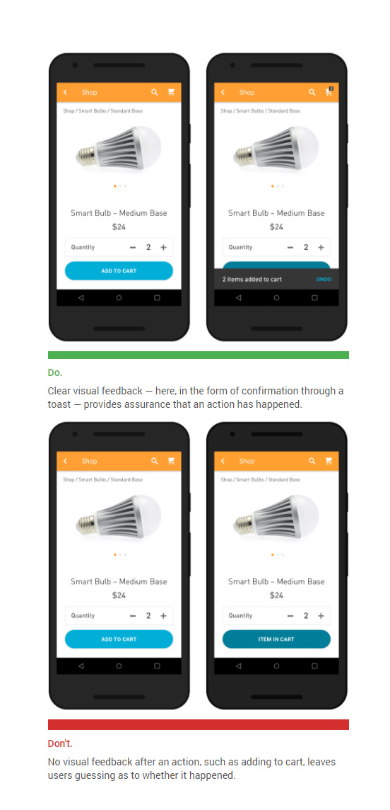
Let users stay assured of their actions. When they add an item to the cart or submit an order, they should be acknowledged. Taking them into confidence, make them stay engaged moving to the next screen or level. This helps in driving engagement and conversion.
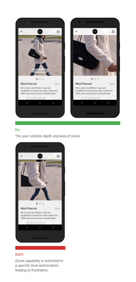
#24. Give zoom control to users

The more you reveal the product to the users the more you are involving him into the deal. Zoom plays that role with perfection. Let users have more authority on zoom so that they can dig deeper and find the particulars of the product from every angle. Applying a random magnification level often fail to work across all target devices.
#25. Ask for permissions in the right context
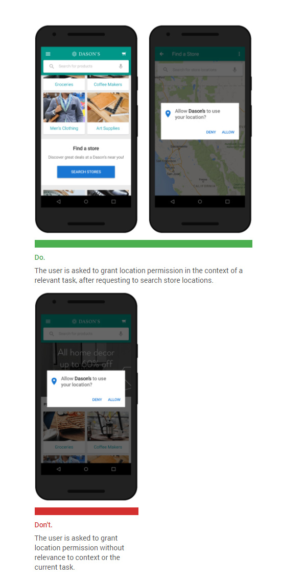
Don?t behave like a dictator who wants to take away information by hook and crook. Sound rational to the users. Make him or she understand that why you need their permission. Proceeding logically and methodically, you are most likely to get an affirmative response from users.
Looking forward to make this conversion a certainty? Visit our Contact Us page to find the contact details. Connect with us the way you want. Our iOS, Android and PhoneGap developers are ready to make a difference to what you do.
(Ideas & images derived from developer.android.com)